HTML5 Forms
The following file is required for this lesson:
Introduction
This lesson builds on the form concepts taught in COMP1017.
Demo Instructions
You can follow along with your instructor to complete this build and/or you can use this document as a guide in completing the demo build.
Steps
- Download the responsive-form.zip file and extract its contents to a folder named responsive-form.
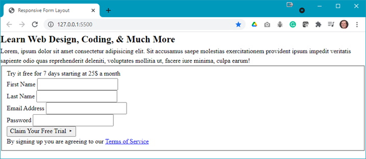
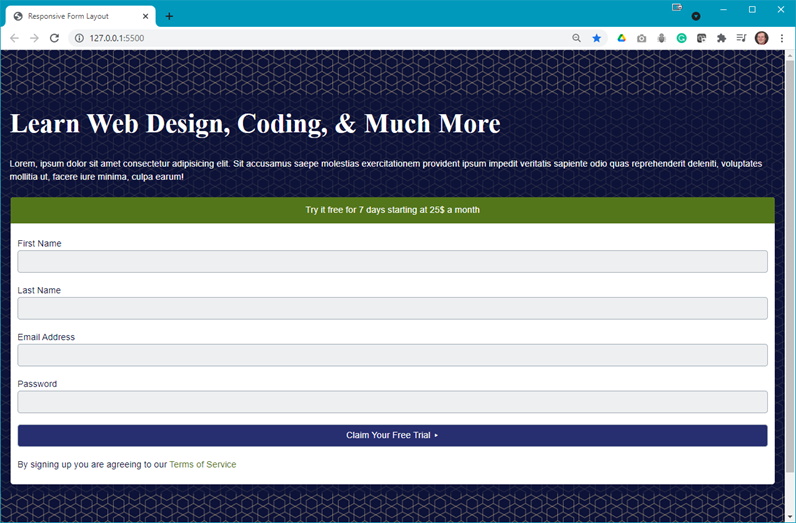
- The output of this lesson should look like:
- Wide width version:

- Narrow width version:

- Wide width version:
- The first step is to build the form in HTML, thus add the following to your index.html:
- Add a <section> for your form (the paragraph has lorem ipsum text):

- Add a <form> below the div:

- To group the form elements nively, add a <fieldset> to the form:

- Add a flex container div:

- Add the input fields of the form:

- Add the submit button:

- Add a <section> for your form (the paragraph has lorem ipsum text):
- Refresh your browser to see:
Question: What are the next steps? - Open your styles.css file and add the following style rules:
- Add the :root style rule:

The :root style rule:

Reference: https://developer.mozilla.org/en-US/docs/Web/CSS/:root - Style the basic elements of the web page:

Notice the use of one of the :root defined colours. - Start styling the form by styling the <fieldset>:

Notice the use of more :root defined colours. - Style the input fields and theier associated labels:

- Style the submit button:

- Style the anchpr elements of the form:

- Add the :root style rule:
- Refresh your browser and make the width wider to see something like:
Question: What is next? - Add the following media queries to your styles.css and refresh your browser after each is added to see the effects:
- Add the following media query to affect the flex container:


Question: What are the changes? - Add the following media query to affect form in the section:


Question: What are the changes? - Add a media query for the max width:


Question: What are the changes?
- Add the following media query to affect the flex container:
- You should now experiment with different browser widths to see the full effect of the styling and media queries.