Responsive Card
The following files are required for this lesson:
Demo Instructions
You can follow along with your instructor to complete this build and/or you can use this document as a guide in completing the demo build.
Steps:
- Download the demo-responsive-card-component.zip file and extract its contents to a folder named demo-responsive-card-component.
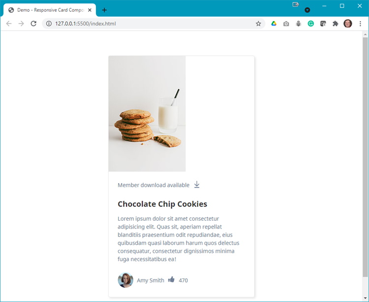
- The completed output should look like:
- Narrow Width:

- Wide Width:

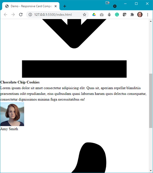
- Narrow Width:
- Modify your index.html with the code shown below:
- Update the <head> with links to the stylesheets:

- Add the following div elements:

- Add a <picture> element:

- Add the following below the </picture> element:

- Add the SVG below the paragraph (remember to copy the code from the SVG file)
- Below the flex container div, add the following (inside the paragraph tags, is a paragraph of lorem ipsum text):

- Between the two paragraphs, add the thumbs-up-icon.svg (remember to copy the code from the SVG file):

- Update the <head> with links to the stylesheets:
- Refresh your browser and scroll to see something like:
Question: What needs to be done next? - Open your styles.css file and add the following style rules:
- Add some initial style rules:
 </l1>
</l1>
- Style the card:
 </l1>
</l1>
- Style the SVG:
 </l1>
</l1>
- Style the card footer contents:
 </l1>
</ol>
</l1>
</ol>
- Add some initial style rules:
Question: Now what needs to be done?
- Add the following media query:
 </l1>
</ol>
</l1>
</ol>