Toggle / Hamburger Navigation
The following files are required for this lesson:
Introduction
This lesson will be taught in three stages:
Demo Instructions
You can follow along with your instructor to complete this build and/or you can use this document as a guide in completing the demo build.
Steps – Stage 1: Basic Toggle Nav
- Download the demo-toggle-nav.zip file and extract its contents to a folder named demo-toggle-nav.
- The completed output should look like when you resize your browser:
Note: When the browser is resized, the menu will start to wrap to the next row. - Add the following code to your index.html:
- Add the <header> block:

- Add the <section> block:

- Add the following code, which must the last line of code in the <body>:

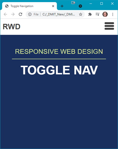
Open index.html in the browser to see:

Question: What needs to be done now?
- Add the <header> block:
- Open styles.css and add the following:
- You will need a .flex-container class:

- Start styling the header and nav:

- Add styling for the menu and hover effects:

- Style the toggle button:

- Style the menu list items:

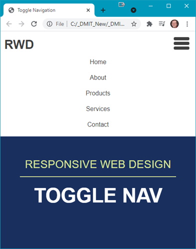
- Refresh your browser to see:

Note: The hamburger icon does not collapse the menu; it is still fixed in place.
Question: What is the next step?
- You will need a .flex-container class:
- The next step is to hide the menu. Add the following rules to your styles.css:
- Style the header nav:

- Create a class that will show the menu:

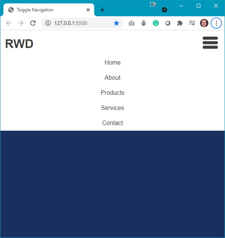
Refresh your browser to see (press the hamburger icon to see the changes):

Question: What is the next step?
- Style the header nav:
- Next the
<section>needs some styling so add the following style rules:
- Initial section styling:

- Style the paragraph:

- Style the heading:

Refresh your browser to see (you will need to resize your browser):

Question: What needs to be done next?
- Initial section styling:
- A media query is needed, thus add the following media query:
- Hide the toggle button (hamburger icon):

- Show the nav by default, thus add the following to your media query:

- Hide the toggle button (hamburger icon):
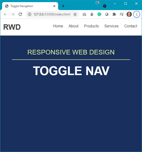
- The result, at a wider browser width, is:
Question: When the toggle button is pressed, the section content is pushed down. Would it not be better if the dropdown menu were an overlayed menu?
Steps – Stage 2: Toggle Nav Version 2
- To get the desired effect make the following changes to your styles.css file:
- Modify the header nav style rule as shown below:

- Add some padding to the menu (add this below the header nav style rule):

- Modify the header nav style rule as shown below:
- Refresh your browser to see the menu now overlays the section content.
Steps – Stage 3: Toggle Nav Version 3
- Download the toggle-nav-3-images.zip file from Moodle and extract the images to your img folder.
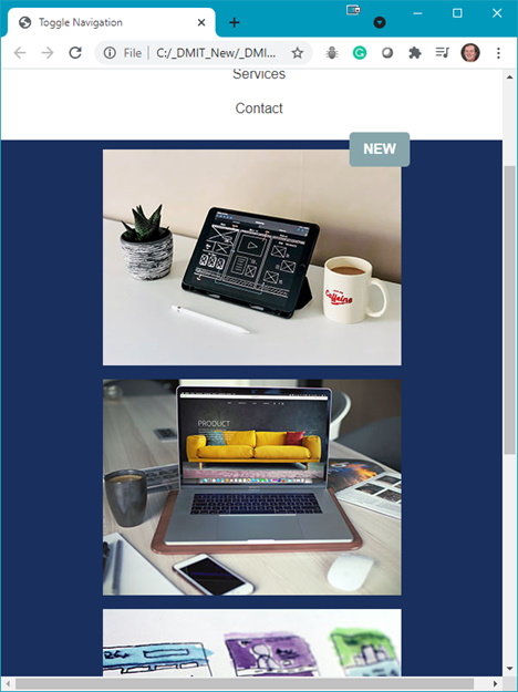
- The completed output should look like (partial view shown):
- The first step is to add the following to your index.html:
- Add the following below the <h2> in the <section>:

You should see the images below the heading. </ol>
- Add the following below the <h2> in the <section>:
- Now add the following style rules below the section h2 style rule:
- Style the .gallery class:

- Style the .thumbnail class:

- Style the <span> class:

- Style the .gallery class:
- Test the results in your browser; use different browser widths to see the full effects.