Responsive Navigation
The following files are required for this lesson:
Introduction
This lesson will be taught in two parts:
Demo Instructions
You can follow along with your instructor to complete this build and/or you can use this document as a guide in completing the demo build.
Steps - Part 1: Single-level Navigation
- Download the demo-single-level-nav-main.zip file and extract its contents to a folder named demo-single-level-nav-main.
- The completed output should look like:
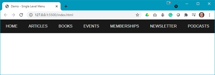
Note: When the browser is resized, the menu will start to wrap to the next row. - The index.html file needs to be updated as follows:
- Modify the <head> to be:

- Add the following to the <body>:

- Modify the <head> to be:
- The web page should now look like:
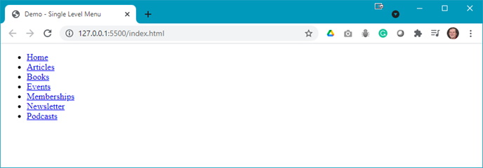
Question: What needs to be done to the menu? - Open the styles.css and add the following style rules:
- Style the <body> element:

- Style the <header>:

- Style the menu <ul>:

- Style the <a> elements of the menu:

Your web page should now look like:

Question: what needs to be done next? - Now add the media query:

Question: What does this media query do? What size is 30em? - When you resize your browser, you should see something like:

- Style the <body> element:
- The
imgfolder contains several SVG files. As a challenge, add these to your menu items and modify your styles.css code to produce the following output:

Note: the green text is a hover effect.
Steps - Part 2: Multi-level Navigation
- Download the demo-multi-level-nav-main.zip file and extract its contents to a folder named demo-multi-level-nav-main.
- The completed output should look like:
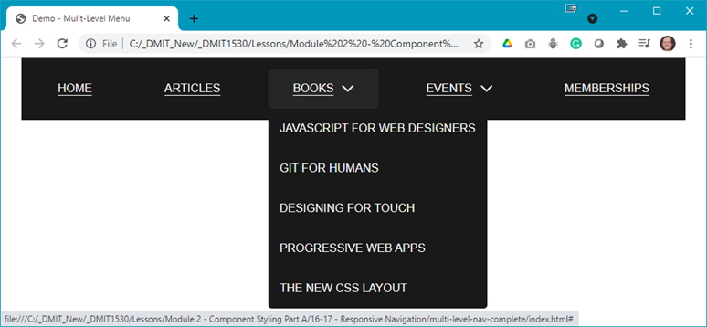
Note: The Events menu also ahs a dropdown menu. - Add the following code to index.html:
- Update the <head> to be:

- Add the <header>:

- Add the sub-menu for Books:

- Add the sub-menu for Events:

- Add the SVG symbol to indicate there is a sub-menu (it is the same SVG for both Books and Events) after the menu item name and before the <a> tag:

The code is easier to just copy and paste the <path d="…"> from the SVG file in the img folder into your code editor.
- Update the <head> to be:
- Running index.html in your browser should now look like:
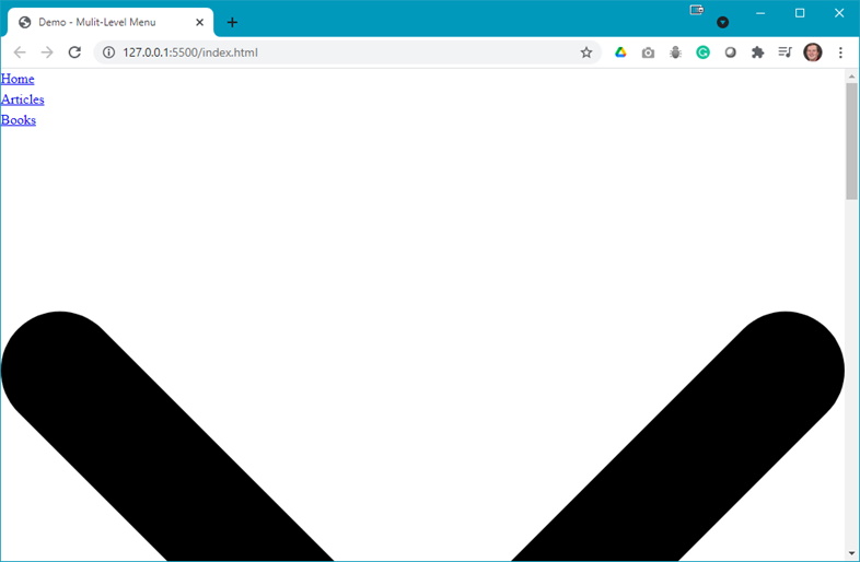
Question: What needs to be done now?. - Open your styles.css file and add the following style rules:
- Style the <body> and <header> elements:

- Add a style rule for the <ul> in the menu:

- Style the <a> elements in the menu:

- Add a hover effect to the menu links:

- Style the sub-menus and the SVG:

- Style the <body> and <header> elements:
- Refreshing your browser, you should now see something like:
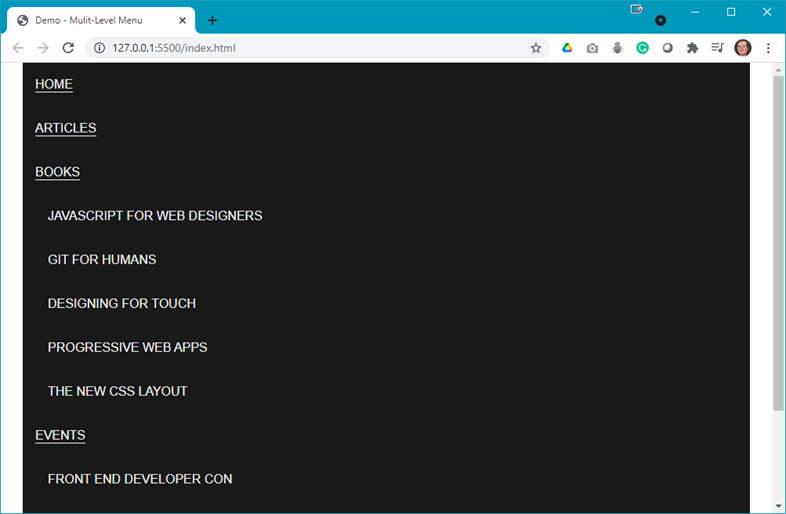
Question: What is next?. - It is time to add a media query to styles.css:
- Add a media query and style the menu:

- Add another rule to your media query to style the list items:

- Add rules to style the sub-menu:

- Add rules to style the dropdown for the sub-menus:

- There does not appear to be a significant change if you now refresh your browser. You need to hide and position the sub-menus by adding the following rule:

- Now add some layout rules for the menus:

The sub-menus are hidden but still affect the display of the menu:

Notice the vertical scroll bar which indicates there is still something there.
Question: How can this be fixed? - Add a rule for the hover state of the sub-menus:

- Add a transition effect for the menu:

- Add accessibility and tab navigation:

Refresh your browser and use the tab key to tab through the menus.

- Add another media query:


Question: What happened?
- Add a media query and style the menu:
Question: In step 7.g, the vertical scrollbar was seen but after all the style rules were applied it was still there, why?