Responsive Background Images
The following file is required for this lesson:
Demo Instructions
You can follow along with your instructor to complete this build and/or you can use this document as a guide in completing the demo build.
Steps
- Download the demo-responsive-bg.zip file from Moodle and extract its contents to a folder named demo-responsive-bg.
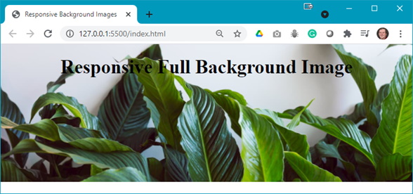
- The completed output should look like:
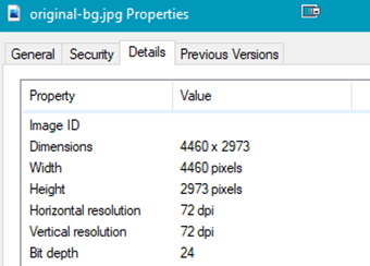
- The first thing to do is find the size of the original image; this is needed as a starting point for this demo:
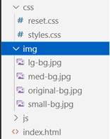
- Use Photoshop or Squoosh to resize the image (save each resized image but do not overwrite the original file):
- 600px x 400px: name this small-bg.jpg
- 1200px x 800px: name this file med-bg.jpg
- 1800px x 1200px: name this file lg-bg.jpg
Note: you should now have 4 images in your img folder:
- You will need to add style rules to the styles.css file:
- Start with the smallest image:

- Style the <h1>:

- Start with the smallest image:
- As the width of the browser increases, the quality of the image degrades. To fix this we need a media query:
- First break point at 850px:

- Next break point at 1000px:

- Finally, a full-sized image for wide screens:

- Open the browser’s developer tools to see:
- Smallest resolution:

- Medium image:

- Large image:

- Smallest resolution:
- First break point at 850px:
Additional Layout
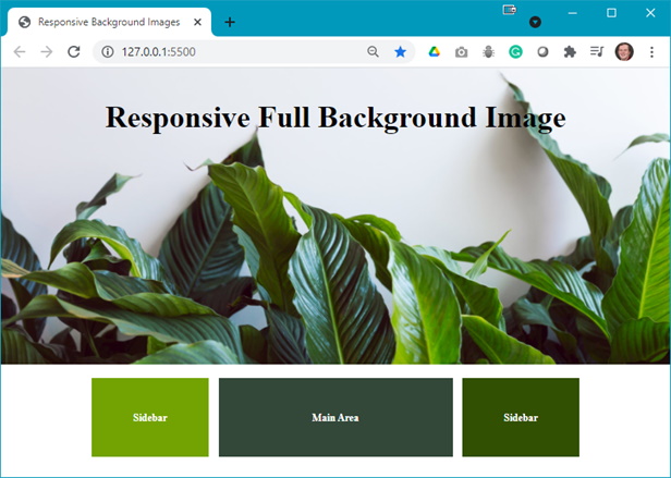
For extra practice you will add content and styling rules to get the output shown below:
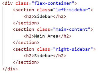
- The index.html file needs the following code added below the
<header>block:
- The following code needs to be added to the styles.css file:
- Add a .flex-container class:

- Style the <section> element:

- Style the first <section> element:

- Style the second <section> element:

- Style the last <section> element:

- Add a media query so you can switch the order back to the original order:

- Add a media query for a fixed-width, edge-to-edge, background image:

- Add a .flex-container class:
- Refresh your browser to see the final output. Additionally, use your browser’s developer tools to see the results at different screen widths.