The following files are required for this lesson:
Introduction
This lesson will be taught in tw0 parts:
Demo Instructions
You can follow along with your instructor to complete this build and/or you can use this document as a guide in completing the demo build.
Steps - Part 1: CSS Selectors
- Download the demo-selectors.zip file and extract its contents to a folder named demo-selectors.
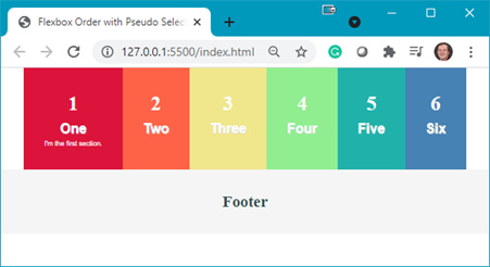
- The completed output should look like:

- You need to add some code to the index.html file:
- Add a flex container:

- Add <section> blocks inside the flex container:

- Add a <footer>:

The output in your browser should look like:

- Add a flex container:
- Now you need to add style rules to the styles.css file:
- Add a .flex-container class:

Question: What does this style rule do? - Add styling for the <section> elements:


- As the individual <section> blocks do not appear, you need to use a pseudo-selector to target the styling of each <section>:
- first-child:

- last-child:

- >nth-child(2):

- nth-child(3):

Refresh your browser to see:

- nth-last-child(3):

- nth-last-child(2):

Refresh your browser to see the following making note of the colours you used for each <section>’s background:

- first-child:
- The <footer> needs to have a different background colour:


- The nth of type selector can be used to target the position of a child element. Each <section> has two <p> elements, thus you can target each of these using:


Note: the font of the 1st paragraph is now bolded and has a slight text shadow: - Targeting the other paragraphs is done using:


- Add a .flex-container class:
Steps - Part 2: Flex Order
- Download the demo-flex-order.zip file and extract its contents to a folder named demo-flex-order.
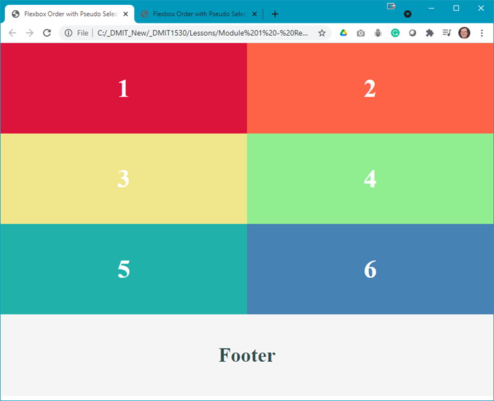
- Open the index.html in your browser to see something like:

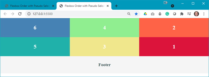
- The completed output should look like:

Question: What do you think we need to do to achieve the completed output? - Examine the styles.css file and make note of the two changes that need to be made.
- Add a media query to change the layout and order of the items:
- Add the media query:

- Change to a 3-column layout and space the <section> elements equally:

- Change the order of the items in the layout:


- Add the media query:
- Position items in the order of 6, 4, 2, 5, 3, 1. In your media query set the order of the other items:
- 4th child:

- 2nd child:

- 5th child:

- 3rd child:

- 1st child:


- 4th child:
- Add a media query to change the layout and order of the items:
- Now you need to test the media query to see what is happening to the output:
- Width < 950px:

- Width >= 950px:

- Width < 950px:
Activity
For extra practice, open the css-selectors-activity.pdf file and complete the activity.