The following file is required for this lesson:
Demo Instructions
You can follow along with your instructor to complete this build and/or you can use this document as a guide in completing the demo build.
Steps
- Download the demo-liquid-fixed-layout.zip file and extract its contents to a folder named demo-liquid-fixed-layout.
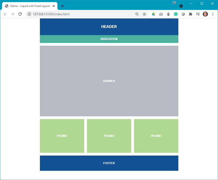
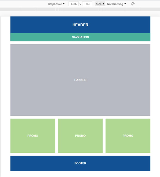
- The output of this demo should look like:
- The first step is to code the layout in index.html (all classes shown in the code will need to be added to your styles.css file):
- Create a container:

- Add a <header> block inside the container:

- Add the <main> with a <section>:

- Add a flex container below the <section> created above:

- Add a <footer>:

At this point, your web page should look like:

- Create a container:
- Now you need to add style rules to your styles.css file:
- Style the <body> element with generic CSS; this will be mobile first:

- Style the <header> and <footer> elements:

- Style the <nav> element:

At this point, your web page should look like:

- As the <section> blocks are not yet being displayed, are they still there? The answer is yes:

Now style the .promo class:


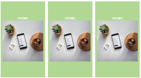
- You need each of the promo blocks to be side-by-side, equally spaced, thus add the .flex-container class:


- You still need the .banner class, which is:


- Next add some padding for the <footer> element:


- Style the <body> element with generic CSS; this will be mobile first:
- The next step is to add a media query that will make the web page change at a specific width. Add the following to your styles.css file:
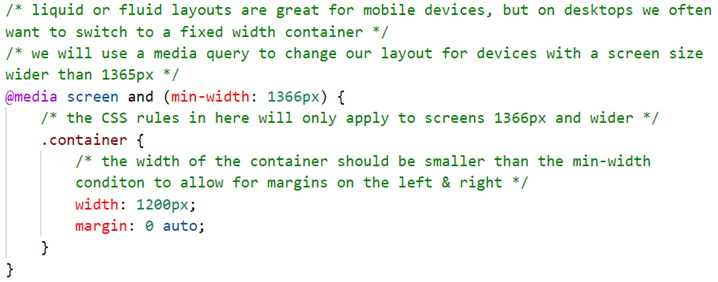
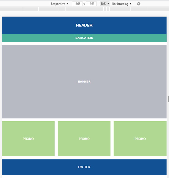
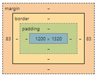
- You need to test this using the browser’s developer tools. Remember the min-width: 1366 px; thus, once the page width exceeds the minimum width (larger screen resolution) the web page will change:
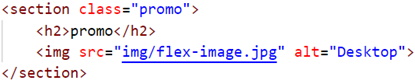
- The next step is to see how images behave in this layout. Add the following code below the
<h2>in each<section class="promo">:
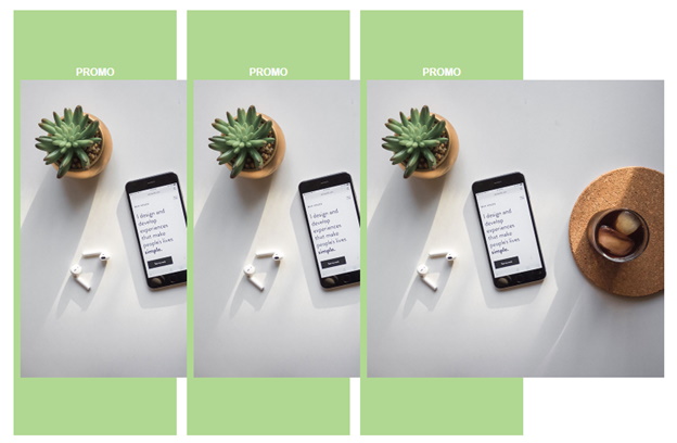
- Notice how the images have broken the layout:
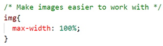
- To fix this there needs to be a style rule to set the maximum width of the
<img>element to 100%. Open the reset.css file and scroll down to line 52. Replace the÷symbol with the following code:
- Using the browser’s developer tools, change the width of the web page and notice how the images scale.
Exercise
Open the flexbox-exercise-instructions.docx file on Moodle and follow the instructions to complete the exercise for this lesson.