Flexbox Layouts (2)
The following file is required for this lesson:
Demo Instructions
You can follow along with your instructor to complete this build and/or you can use this document as a guide in completing the demo build.
Steps
- Download the demo-flex-flow.zip file from Moodle and extract its contents to a folder named demo-flex-flow.
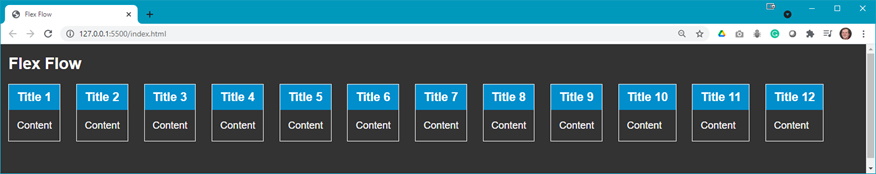
- The first goal of this demo should look like:
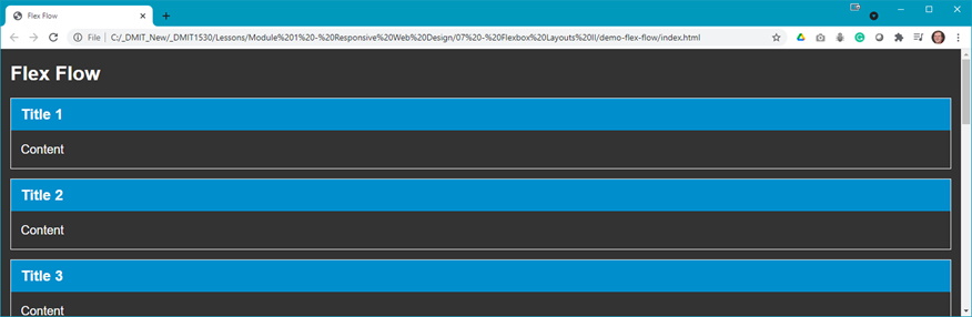
- Open index.html in your browser to see something like:
Question: What do you think you need to do to achieve the desired output? - Add the following style rules to your styles.css file:
- Add a .flex-container class:

- Modify the following code in your index.html:


- Add a .flex-container class:
- There are other properties of flexbox that you can set. First you will look at
flex-direction. Do each of the following and examine the output:
- flow:

The output should not have changed. - flow-reverse:

- column:

- column-reverse:

- flow:
- Now you can examine the
flex-wrapproperty. First set theflex-flowtorow, then do each of the following:
- nowrap:

The output should be the same as shown in step 4b, or if you make your browser window narrower:

- wrap:

- wrap-reverse:

- nowrap:
- Finally, you can combine
flex-directionandflex-wrapasflex-flow. First comment out all the style rules afterdisplay: flex;and do each of the following and examine the output.
- Default setting (flex-flow: row nowrap):

- flex-flow: row-reverse wrap:

- flex-flow: column-reverse wrap-reverse:

There are other combinations which you can explore.
- Default setting (flex-flow: row nowrap):