Screen Design
Visual Processing
- Anything that is seen by our eyes must be processed
- The processing difficulty depends the complexity of the visual scene and on our previous memory of the scene
- Images that we already are familiar with simply match to images stored in our memory
- The processing time is fast
- The processing effort is low
Organization of Screen Elements
There are 10 elements of screen design:
Balance
- Equal weight of screen elements
- Left to right, top to bottom
| Balaanced | Unstable |
|---|---|
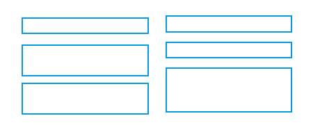 Left column processed - right column start position noted as same |
 Both columns need to be completely processed |
Symmetry
- Replicate elements left and right of the center line
| Symmetric | Asymmetric |
|---|---|
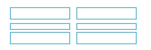 Left column processed - right column noted as same |
 Both left & right columns processed plus relationship of right to left |
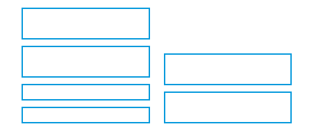
Regularity
- Create standard and consistent spacing on horizontal and vertical alignment points
| Regular | Irregular |
|---|---|
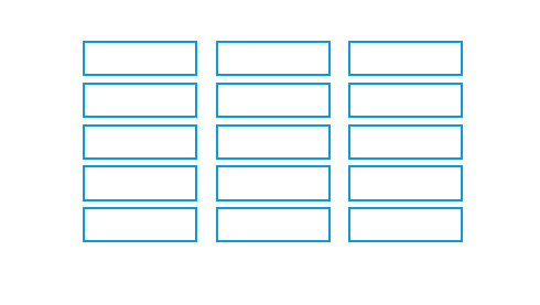 Left column processed 2 right columns noted as same |
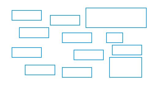 Location & size of each object processed |
Predictability
- Put things in predictable locations on the screen
| Predictable | Spontaneous |
|---|---|
 User expects title and menu bar on top of screen |
 Visual scene needs to be completely processed - objects not in expected places |
Sequentiality
- Guide the eye through the task in an obvious way
- The eye is attracted to:
- Bright elements over less bright

- Isolated elements over grouped
- Graphics before text
- Color before monochrome
- Saturated vs. Less saturated colors
- Dark areas before light
- Big vs. Small elements
- Unusual shapes over usual ones
- Bright elements over less bright
- The eye is attracted to:
| Sequential | Random |
|---|---|
 |
 |
Economy
- Use as few styles, fonts, colors, display techniques, dialog styles, etc., as possible
| Economical | Busy |
|---|---|
 |
 |
Unity
- Make items appear as a unified whole (for visual coherence)
- Use similar shapes, sizes, or colors
- Leave less space between screen elements than at the margin of the screen
| Unity | Fragmentation |
|---|---|
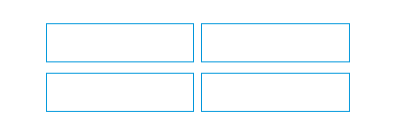 |
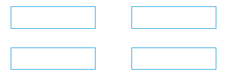 |
Proportion
- Create groupings of data or text by using aesthetically pleasing proportions
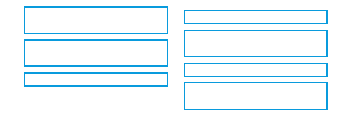
Simplicity
- Minimize the number of aligned points
- Use only a few columns to display screen elements
| Simple | Complex |
|---|---|
 Only four alignments need to be processed |
 A total of nine alignments need to be processed |
Groupings
- Provide functional groupings by associated elements
- Create spatial groupings, evenly spaced
- Allow 1/8 to 1/4 inch between
- Visually reinforcing groupings
- Provide adequate separation between groupings through white space
- Provide line borders around groups
Simple Grouping
- Similar elements aligned vertically
- Vertical distance between similar objects small
Boxed Grouping
- Boxes add additional complexity to form
- Spatial arrangement adequate
Background Grouping
- Color adds additional visual complexity
- Spatial arrangement adequate
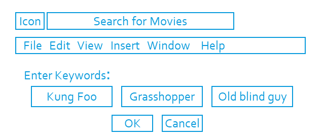
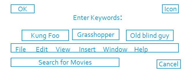
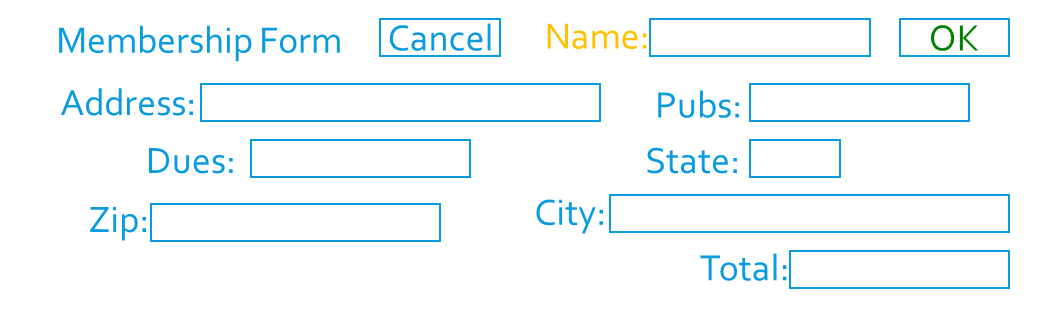
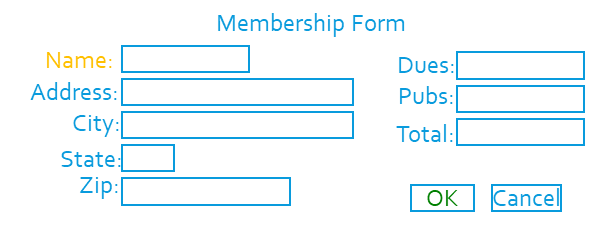
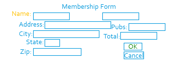
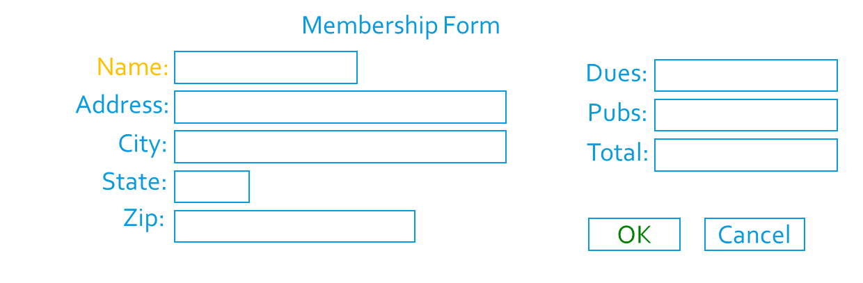
Examples
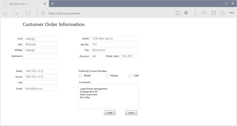
Question: What is wrong, or can be improved?
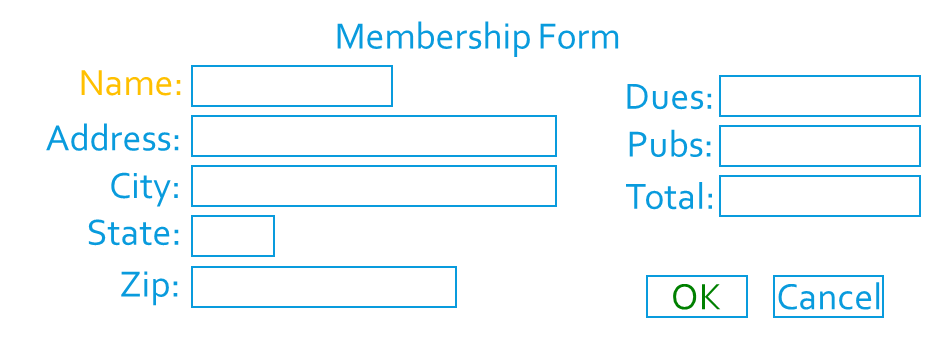
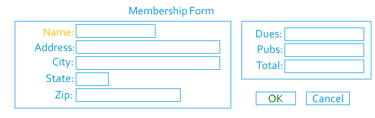
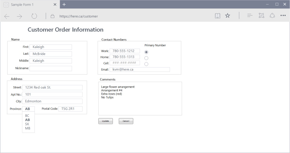 Note: Notice the improvements make this form easier to use.
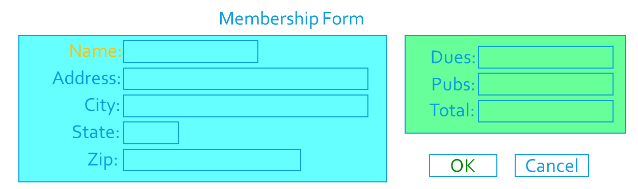
Screen Design
Users want:
- Orderly, clean, clutter-free appearance
- Obvious indication of what is being shown and what should be done
- Expected information located where it should be
- Plain, simple English (Language)
Text
- Fundamental goal is clarity and simplicity
- Noticeable and disguisable
- Interpretable and attractive
- No translations, external references to documents
- Be consistent
- Guidelines
- Used mixed-case for:
- Control captions
- Data
- Text
- Messages
- Instructional information
- Menu & button descriptions
- Use upper-case or capitalization for
- Title
- Section & sub-section headings
- Used mixed-case for:
Fonts
- Use a sans serif font
- Easier to read
-
Which is easier to read?
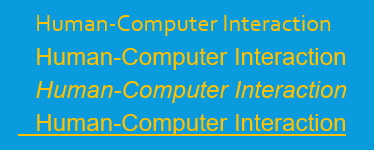
- Use simple readable fonts
- Sans serif (e.g., Arial, Helvetica)
- Times Roman (serif)
- Use no more than two families
- Assign separate purpose to each family
- Allow one to dominate
- Headings, subheadings, etc.
- Use no more than:
- Two styles of the same family (e.g., standard and italic)
- Two weights
- Regular and bold
- Use no more than three sizes
- Usually 12 pt. for menus
- 10 pt. for windows
- Minimum is 8 pt.
- Never change established type sizes to squeeze in text!
- Always consider the visual capabilities of the users.
| 8-point font | 12-point font |
|---|---|
 |
 |
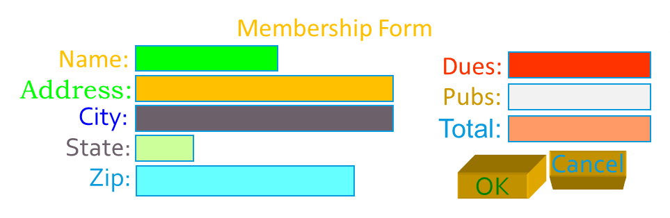
Fonts & Colours
- Avoid using colored fonts
- Use bold for emphasis
- Do not use color: users typically assume color is a cue for text with a different or specific purpose, such as hyperlink.
- Avoid changing font size
- Does not get attention, is distracting
- Use color to get attention
- Use when it is critical that users notice a certain part of the screen
STATUS STATUS
- Use when it is critical that users notice a certain part of the screen
- Use color purposefully
- Use sparingly or it loses its effectiveness
- Combine color with redundant highlighting

- Be aware of color blindness
- Blue-green, red-green
- 9% men, 2% of women
- Use colors consistently
- Red: always warning (?)
- Green: always good (?)
- Use cultural color meanings
- Red, yellow, green, blue, black
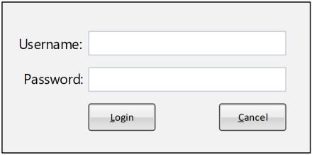
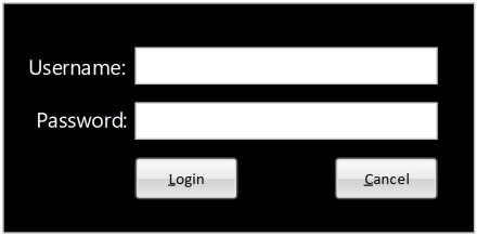
- Use light backgrounds for main areas
- Off-whites and light grays
- Increases contrast
| Light Mode | Dark Mode |
|---|---|
 |
 |
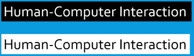
- Avoid red and blue combinations
- Avoid blue text
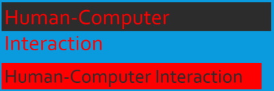
- Avoid blue text
- Avoid light text on dark
Choosing Graphics
- Use graphics for a purpose
- Icons
- Button Images
- Descriptive graphics
- Picture of house in a real estate application
- Use graphics for international use
- Sometimes better than particular language
- Meaning same for everyone
- Use standard graphics
- Already tested with users
- Know that meaning is understood across user population
- Guidelines
- Windows
- Mac
- UNIX
- Already tested with users
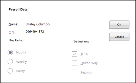
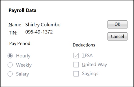
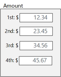
Duplication
| 1st Amount: $12.34 2nd Amount: $23.45 3rd Amount: $34.56 4th Amount: $45.67 |
 |